An İznik Tile Seen From the Edge
A floral spandrel at the Cleveland Museum of Art shows how painters could make a design feel expansive inside a boundary they could not move.
In this story 4 sections
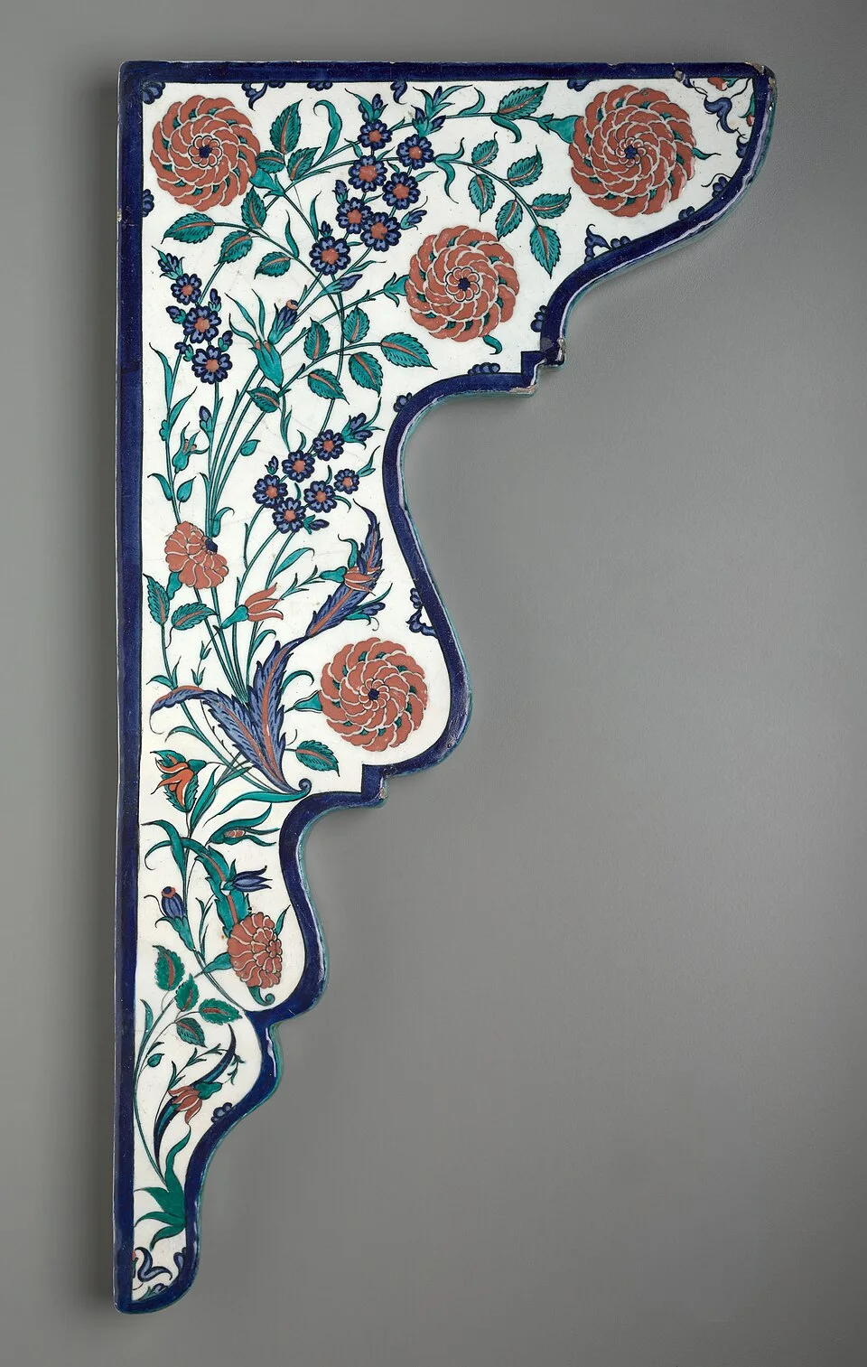
It is hard to look at a good photograph of an İznik tile without following a stem. In the Cleveland Museum of Art’s Tile Spandrel with Floral Sprays, blue and red details guide the eye over a white ground, while the contour of the object keeps interrupting the path. The tile is not a rectangular painting framed after the fact. Its curved boundary is part of what the maker had to work with. The name on the label is a clue. A spandrel is the area beside the curve of an arch, between the curve and the surrounding architectural lines. A design for that space has to stretch in one direction as the space pinches in another.
The museum dates its example to around 1570–75 and attributes it to İznik in the Ottoman period. The date establishes a setting, but it does not tell you much about the choices available to a person filling that shaped area. Turn your attention to the outer line, even if the red is the first colour you want to look at. The bends along the perimeter make the shape itself feel as deliberate as the flowers. A choice about whether to cut off a leaf at the edge or give it room to turn is a choice about the finished room. Once you see the problem, a single museum object takes on some of the scale of a wall.
Give the curve the first word
Set a rectangular sheet of paper on a table. Mark an arc from a point halfway down one side to a point halfway along the bottom. Shade the space outside that curve. You have a broad region that shrinks to a narrow approach next to the edge. Try to draw a vine across it without making the middle look thin and without packing all the leaves into the generous end. Every shortcoming becomes obvious. A stem that leaves the centre too quickly cannot use the room still available there, but if the growth waits too long to turn, the outside of the bend looks empty and accidental.
The tile solves a kind of compositional puzzle that a printed swatch can often ignore. A repeating wallpaper pattern can disappear at a corner and carry the implication that it would have continued beyond it. Here, the association with an arch makes the ending visible. A stem or flower that moves in sympathy with the curve helps the person looking upward to read the whole design as a unit. Shaped areas in buildings change scale as we move around them, but the edge remains a reference point. It gives the hand at work on a table a way to take account of an observer standing several metres below.
That exercise also helps put a limit on what a single object can prove. A spandrel in a collection may no longer have the companion piece that suited the other side, and the surviving surface need not establish its exact place on an original wall. The museum’s catalogue gives the facts it can support about this piece. Viewers can ask how it might have related to an arch without treating a plausible reconstruction as a record. The curve offers evidence of a designed relationship; the record establishes how far you can take that relationship in identifying a particular building.
Look at the ground between the stems
The pale ground is doing a surprising amount of work. It separates the small lines and red accents, and it allows the outer edge of a leaf to hold its shape when you step away. Put a fingertip in the air over one of the larger flowers from a comfortable viewing distance. You may find that much of what you see as a flower consists of the light space bounded by several gestures. Seen up close, the narrow lines pull the forms together; seen farther away, the whites between the forms help keep them apart. An object with readable details at both distances has to distribute its contrast carefully.
Photographs bring another choice into the view. The isolation of the tile against a plain background makes its edge recoverable, but even lighting can make a glazed surface behave like a flat print. In a room the result depends on direction. A highlight can pass over part of a stem as someone walks by, and a slight turn of a glossy tile can make one colour appear less separate from its neighbour. Look at the museum image for the arrangement and remember that the surface of the object still sits in three dimensions. Glaze is a real material with a surface, not a style applied to a digital picture.
It is possible to recognise aspects of the design as leaves and flowers without turning each form into a botany quiz. The conventions are painters’ tools. They allow a shape to be stretched or turned while preserving enough of its internal pattern to remain legible. A leaf that looks too expansive on its own may be exactly what the wide part of the spandrel needs. A flower in the pointed end can bring the eye back to the narrow boundary. The strongest evidence about this arrangement is often in the spacing: the pattern is grouped and tilted to suit this surface.
Work backward from the finish
The catalogue identifies the tile as fritware with decoration under glaze. Fritware is a ceramic body with a high proportion of crushed silica. In a workshop that takes a painted object through firing, there is a gap between the look of the working surface and the look of the finished one. The colours and contours have to survive the processes that make the surface hard and glossy. Making a tile for architecture adds a practical demand: the piece must still fit a shape when it comes out the other end of that process. A painter cannot simply make the last few centimetres bigger after watching how the flowers turn out.
None of that means you can reverse engineer the exact order of every gesture from a photograph. It means you can look for evidence of decisions at different levels. The boundary might derive from a building plan or a template; the broad distribution of pigment from a drawing or a convention learned in a workshop. The exact pressure of a line where two shapes come together belongs to the execution of this object. A viewer can admire the painter’s hand without offering the painter full credit for the ceramic body or the architectural proportions. That is part of what makes small decorative objects useful evidence about collaborative work. They show multiple trades and types of judgment in one object.
The same line of reasoning makes a museum catalogue more useful than a quick image search. An image search may return a modern product that looks similar, a whole wall, a plate with the same colours, or a duplicate photograph. The accession number identifies one object that can be described and compared. Note whether the materials entry deals with the always visible surface, the hidden body, or both. Look at the dimensions so that a photograph filling a monitor does not accidentally make a small tile seem as large as a doorway.
Put the tile back beside a building
Once you have looked carefully at the spandrel by itself, walk around a building with an arch and spot the spaces that a rectangular image would leave unresolved. A shop window in a brick street can be enough. The patch between a curved top and the outer rectangle might be filled with plain brick, a stone detail, a sign, or nothing that stands out at all. Notice where your eye stops and what direction the curve invites you to follow. If you try to imagine a painted panel in that patch, you are close to the problem the makers had, even if the materials and circumstances are entirely different.
At the museum, reverse the exercise. Cover the centre of the image briefly with your hand and look at the narrow end. Let your eye follow the border into the wider body, where the stems have room to separate. Then look at the catalogue image normally again. Does the surface feel balanced when you remove the imaginary arch from your vision? Does it feel balanced in a different way when you put the arch back? A reader can disagree about the answer and still arrive at something specific. The disagreements that matter refer to particular turns of the pattern rather than a generic impression of richness.
The edge is also a reminder about how an object reaches the museum. An architectural piece can keep its shape long after the relationships that gave the shape a purpose have been broken. The title tells us which relationship to look for. The paint tells us someone was capable of doing something inventive inside a limit. Seen that way, the spandrel is as much about a practical act of fitting as it is about a tradition of flower painting. It needs the missing curve to make all of its sense, and because the shape survives, we can go a little way toward imagining that curve again.