Why the Kelmscott Chaucer Begins With Two Pages
William Morris’s 1896 edition asks readers to take in two facing pages before settling on a line of text. Its opening shows how a printer can organise attention across the fold.
In this story 4 sections
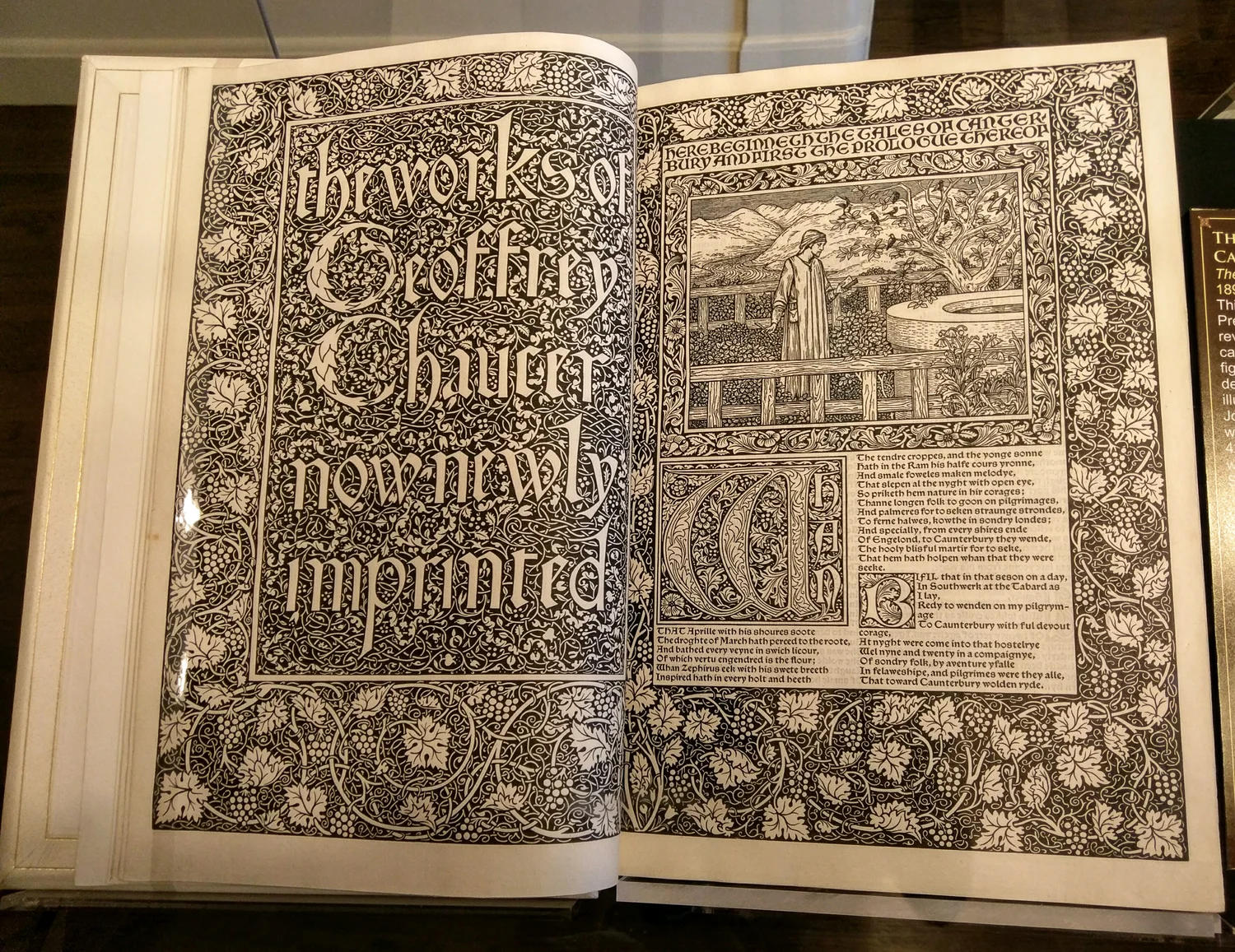
Choose one line of type from a photograph of the Kelmscott Chaucer and it is possible to concentrate on the shape of the letters. Return that line to the opening and the letters seem to have acquired a different size. There are borders, large forms and patches of pale paper with competing claims on your attention. The pages meet at a narrow strip that no designer can fill in the same way as an area farther out. The book remains readable, but the first encounter is with the spread as a whole. It takes an instant to decide where to begin.
The Kelmscott Press printed this edition of Chaucer’s works in 1896. William Morris designed the typography and ornament. Edward Burne-Jones made the designs for illustrations that were translated into wood engravings by W. H. Hooper. It took a series of people and processes to give drawing, decoration and lines of text the appearance of one deliberate surface. Surviving copies in collections allow a reader to check how the parts work. The digital photographs are particularly helpful when they preserve the gutter and enough of each margin to let both pages keep their relationship to one another.
Locate the first place where your eye stops
Look at the spread for a moment without reading. A beginning may be marked by ornament, a short red phrase or a block where the distribution of the dark parts changes suddenly. If you use a screen, keep the zoom low enough to take in both leaves. Make a note of where your eye went first. Then look at the opening as someone seeking the start of the text. The two places can be different. An illustration must have enough presence for its lines to hold together. A reader also needs a path from the illustration to a text block without spending much time deciding how to enter it.
A cheap way to understand the arrangement is to draw two boxes with a small gap. Mark the big areas of dark and light in each without representing any words. Include the gap and the major inside margins because their combined width has a role in separating the pages. The sheets together have a width that neither page has alone. Some large shapes can balance without being placed in exactly corresponding positions. An edge shared by blocks of type can feel orderly even when there is no matching image on the other page. A balancing act can be made visible at a scale where the design of a single letter is far too small to see.
Next isolate one facing page by covering the other briefly. Notice whether the inside margin now appears insubstantial. Restore the second page and the two inside edges now meet in a much wider field, interrupted by the gutter. Many reproductions cut one page from a spread for reasons of space. That can make a well judged single page seem lopsided while losing the view for which it was laid out. The imbalance can also be misleading in the other direction. A flattened digital image presents two whole pages at once, while a bound volume can put some of their inner edges into shadow.
In the photographed opening, a title fills most of the left leaf. A smaller figure in a landscape occupies a large rectangle high on the right. Below it, the blocks of lettering are set around a conspicuous initial. The pair combines an almost uninterrupted field of decoration with several distinct places to pause. It is possible to recognise the transition from title into reading before picking out the spelling of an individual word.
Let the columns set your reading speed
In a page of dense type, movements from line to line are part of the physical act of reading. A column with a manageable width limits the distance the eye has to travel to find the next beginning. Open a photograph to a text page elsewhere in the volume and check how many places there are where the thread can be picked up. A heading, a conspicuous first letter and a surviving space under an illustration can give different kinds of assistance. Imagine a person reading steadily rather than admiring a page. Fonts and decorations become more interesting when you consider how someone would return after looking away.
Compare the spaces inside the letters with the intervals between them. A darker typeface can still be easy to follow when its lines and words remain distinct. The visual weight of a printed surface involves the proportions of the black shapes, the paper they enclose and the white intervals that help groups of letters become words. A photograph of an isolated letter can show parts of this structure. A page gives you an opportunity to see how the structure holds up over a paragraph. The sensation of density depends on more than the heaviness of any one stroke.
There is a good reason to start with an actual page from the book when making this comparison. A contemporary font styled after a Kelmscott typeface can provide some details and come with a different set of spacing decisions. The thickness of a line reproduced on a backlit screen varies with zoom. A copy with a large border and small type can lose its balance on a modern screen if the viewer has to magnify and pan to see a whole line. That is a finding about the reproduction and the screen. It does not give a direct account of how a printed copy holds itself in the hands of a reader.
Pictures had to become printable objects
An illustrator’s design can indicate a thin black line on white and leave the means of producing it to another person. In this edition, Hooper’s engravings were one of the stages through which the book’s drawings became reproducible. The printing surface had to survive use and provide marks in the right places. Look at the closeness of parallel lines in an illustration and imagine how much of the life of the drawing is made from the width of the pale gaps between them. Holding those gaps open through the process matters as much as retaining the conspicuous outlines.
At a different scale, type and engravings have to share the job of keeping a page understandable. A line from a plant border can move into a narrow, curling shape and demand attention for its own sake. A line of text has to return a reader to the next line in a predictable way. A set of lines in a figure can mark its movement or position. Compare a collection of small marks from each of those areas in the same spread. The deep black ink can give them a shared weight while their relationships make them behave differently on the page.
Look for a strip of white paper between a block of decoration and a block of letters. That small interval may make it possible to see both without mistaking one for the other. It also has a job that vanishes in an image cropped to show only the decoration. Reproductions made for different purposes can all be faithful within their crops. A complete spread is still needed to talk about the spacing decisions that connect them.
The Morgan and Leeds records can help establish which physical objects you are comparing. The meaning of a catalogue entry changes depending on whether it describes the edition in general or one copy. Paper, binding and provenance can be recorded for individual examples. If you are reading a photograph with an unusual feature, check the accompanying identifier before assuming it applies everywhere. Variations among surviving books give a reader good reason to keep the title, date and copy information next to an image.
Keep a walk through the opening
Choose the most prominent starting point on the spread again. This time trace a path from it to a line you could actually read. Then move to a small area of detail that your first glance passed over. You may find that the two pages make sense in a different order depending on whether you are there to read Chaucer or to inspect a work of printing. The design accommodates both possibilities in the same amount of paper. Its vividness comes in part from how well it keeps one route from blocking the other.
Try the same exercise with any familiar book where an illustration or chapter title occupies a large part of the opening. Set it flat enough to see the two pages, without forcing the binding, and sketch where the blank paper intervenes at the centre. Several of the Kelmscott decisions become easier to understand as ordinary problems solved with unusual care. Somebody had to establish the start of a line, leave space for a fold, and give an image size without making the words incidental.
The experience of opening the Kelmscott Chaucer can be surprising even after you know what is in it. The visible plan brings work by several makers together, then allows the reader to pull a small section out of the plan by attending to it. The opening can support a glance, a pause for the pictures and the slower work of reading words in order. To take any one of those experiences seriously, it helps to keep the other page in view.