The Side a Postcard Kept for the Address
Before U.S. picture postcards shared a side between address and message, a printer had to find room for words somewhere else. A Revere Beach card preserves the older arrangement.
In this story 5 sections
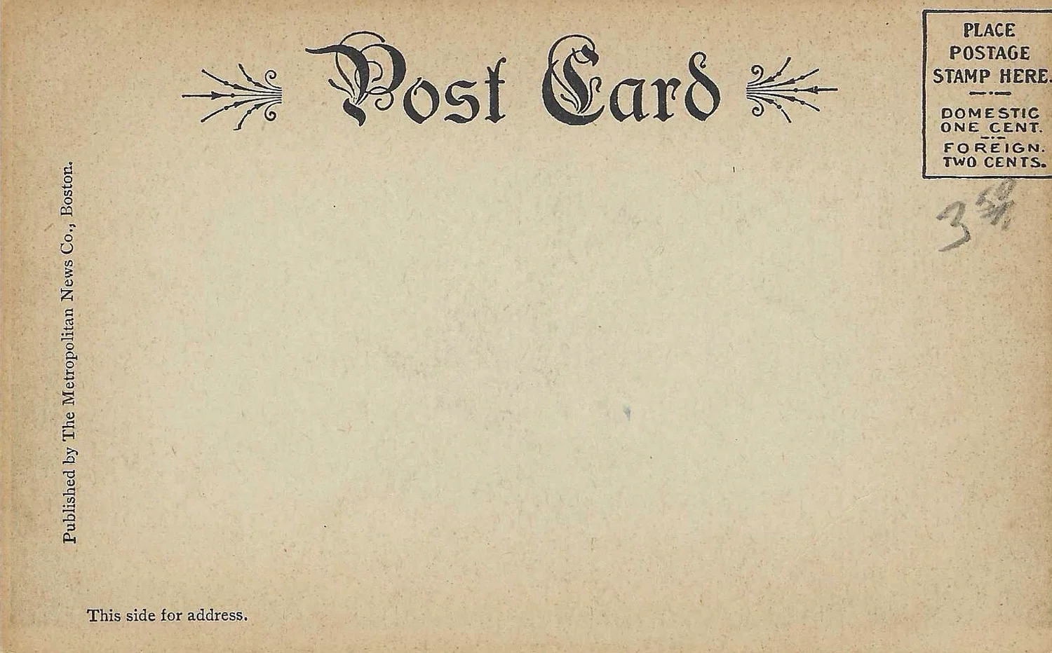
The broad blank face of the Revere Beach postcard looks, from a modern distance, like an invitation to write everything a holiday just gave you time to think about. At the top it calls itself a post card. A stamp has a position set aside for it in one corner. Small words along the lower edge identify the side as a place for the address. Apart from traces left in the paper's later life, the sheet gives the sender very little encouragement to turn that broad rectangle into a letter.
The address-side image on this page is from an early twentieth-century card published by the Metropolitan News Company of Boston, according to its image record. The Smithsonian Institution Archives describes the American period in which a picture postcard's back could be reserved for the address and explains the later change to a divided back. That history helps a reader see something in the card other than a shortage of printing. The blank is the region assigned to an important other use.
An address needed its own unambiguous place
An envelope lets a person keep the letter inside and put the address outside. The postcard dispenses with that physical separation. It can still assign particular lines and surfaces to different purposes. A person reading the front can recognise an image or message. A person handling the address side can look for a name, a destination and the stamp. Dividing responsibility between two faces is something a postcard printer can make clear with remarkably little ink.
The short statement about the address does real work on the Revere Beach card. It is set at the edge, leaving the larger field open. A sender is able to add lines of variable length without being boxed into a single exact address. The street, place and person's name can all fit together where the opposite face holds the visual subject. A sparse layout is appropriate when what fills it is allowed to change with every sender.
A card like this is easy to misunderstand as a blank left by error because modern cards have familiar vertical rules on the reverse. The rule on a divided card performs a new task, separating some space for correspondence from the area for routing the card. An undivided back did not have to show the division on that face. Its counterpart was elsewhere. What changed was the location of writing.
The picture side had room for an interruption
The Smithsonian describes earlier American private mailing cards that could carry a message on the front and notes that a small space could be left there when a picture shared that face. To reconstruct the sender's options, look at the image side before deciding that a large empty back made writing easy. A slim band near a photograph may have been the practical region left for an extra line. It matters how the printer treated the edges, not simply how big the entire card was.
A simple model starts with a landscape view in the centre of a piece of paper. Leave a rectangle below it open. Put a message in that rectangle and notice its relation to the image. A person can now see the image and the accompanying words at once, but the size of each affects the room available for the other. A larger border makes writing easier and can reduce the picture. A border reduced to a thin strip invites a much shorter message. A modern reproduction of the picture alone can lose evidence of this original choice.
This is different from saying that every surviving card uses a neat printed space in exactly the same manner. A sender could put writing elsewhere on the picture side or leave the available space unused. Another card may have been kept without being sent. The description of a common format gives questions to ask of the individual object. It does not substitute for examining where writing actually appears on that card.
A date range describes the convention, not every copy
The Smithsonian describes an American post card period from 1901 to 1907 associated with undivided backs, and describes a change permitting messages on the address side beginning in 1907 for the relevant cards. That is valuable context for reading layout. It does not mean that an image of an undivided back by itself sets an exact publication or mailing date for every object. An unsent copy might have been kept long after the printing date. A used copy can carry a postmark from a later day. The recorded date needs a label for what it measures.
When an archive documents a card, it can therefore give room to more than one time. There is the period associated with the design, the date of mailing when evidence survives, and the date of the photograph or scan. Owning a card can add a separate history. A note made by a collector on the blank edge is not automatically a message from its first sender. The value of a dated record is that it helps separate those layers rather than prompting a guess about one indistinct mark.
There are also different rules and conventions outside the setting described in the Smithsonian's American timeline. A collector comparing a card from another postal administration should not assign an American date by matching the presence or absence of a rule. Give the place and authority a line of their own. The design of a postcard can carry evidence about a postal system only when the system under discussion is identified.
Which face is the front?
The words chosen for the card itself also have a history. The Smithsonian traces the transition from the longer title required on certain private mailing cards to permission to print a shorter designation in 1901. The Revere Beach example's simple heading supplies the object name without telling a future reader why earlier cards might use more words at the same place. A group of dated examples can make that difference obvious. Copy just the image face into an album, and part of the change will disappear even though all the pictured subjects are still there.
The small stamp box is another useful survivor. It separates a relatively stable corner of the layout from the address that will be supplied by a sender. A historian comparing used cards may find parts of such an emblem covered by a stamp or postmark. An unused example can show what the printed corner looked like before either was added. The same feature can thus carry evidence about printing in one copy and about mailing in another. Which copy is more useful depends on whether the question is about the design or the route.
Putting a used and unused card side by side also changes what blank means. On the unused address surface it can describe the area waiting for a destination. On a photographed used card it could describe a place that was never written in, wore away or is difficult to see under the lighting. Signal the difference when making a transcription. It keeps a gap in evidence from being mistaken for a deliberate decision by a sender.
For a publisher showing a resort, the picture is an obvious front. For a person sorting mail, the area carrying the destination is what makes the paper useful. An archive may call each side by its function or supply labels such as front and back. Readers using two scans should confirm which face shows which information instead of insisting that everyone used the same term. If only the picture was saved, evidence about the postal layout can disappear while the popular view still circulates.
The Revere Beach records link the address side and front as versions of the same card. This relationship matters even if the most attractive image might be the one with the resort scene. The illustrated face can help identify a subject and publisher. The back makes a claim about the sender's use of an otherwise empty area. An archivist recording both makes it possible to notice a design feature that an exhibition about beaches would reasonably leave off its wall.
One way to take notes is to mark what each image can confirm. One view can help establish the visual subject. The other can show the address convention and printed publisher information. Beyond that, a person can ask whether markings are preprinted or added later, and which elements survive clearly enough for identification. Assigning those questions their own places keeps an uncertain pencil mark from changing the date of the printed design without a reason.
An unused space is still part of a printed object
Return to the blank with the expected address in mind. It is useful because it can accommodate words chosen by a sender, rather than because the printer forgot to fill it. With the period context restored, a space the size of a short message becomes the place reserved for a name and destination. Nothing needs to be added to the old card for the arrangement to become visible.
The small region near a picture on another face can then be understood as an answer to the same layout problem. A person had something else to say and somewhere else to put it. The division of words across both faces tells more about the postcard than a reproduction that leaves the quiet side behind. One surface shows what the publisher wanted to send into the world. The other prepares the way for somebody to send it.