The Second Side of a Roman Coin
A bronze coin from Nicopolis ad Istrum puts a Roman emperor on one face and a youthful Apollo on the other. Looking at the two together changes what the object can tell us.
In this story 5 sections
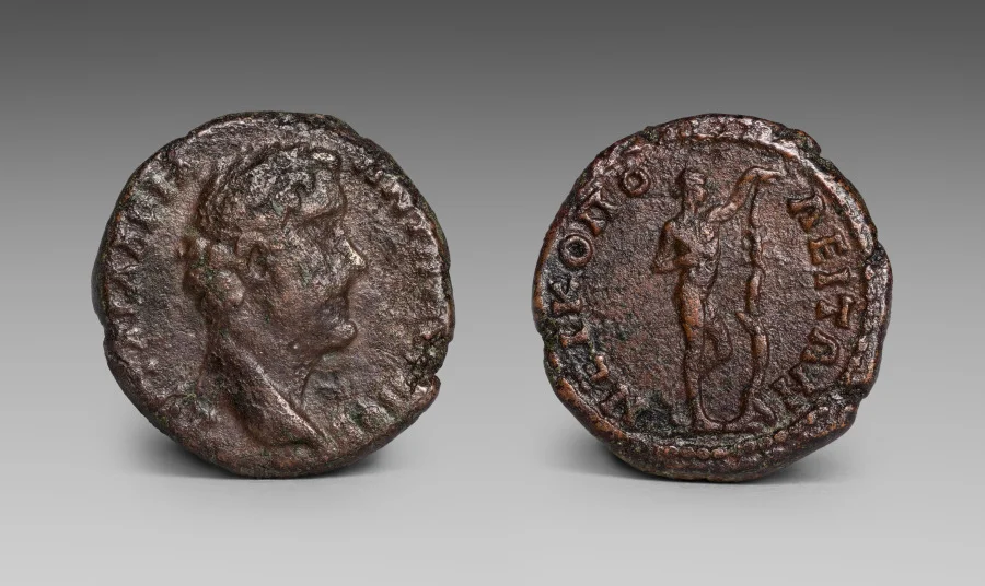
Put a ruler against the reproduction before deciding how much of the image you would have noticed in your hand. The Cleveland Museum of Art records this bronze coin at two centimetres across. In the museum photograph, both faces are larger than that, and the two photographs sit side by side. The enlargement helps the eye separate ridges from shadows. It also makes it easy to forget that a person handling the coin could see only one face at a time. Between the head of a man and the standing figure on the other side, there was a small act of turning.
The museum identifies the man as Antoninus Pius, who ruled the Roman Empire from 138 to 161 CE. It names the figure opposite him as Apollo Sauroktonos and assigns the mint to Nicopolis ad Istrum, in the Roman province of Moesia Inferior. Those names and places are more legible in the catalogue than in the photograph. The job of looking is to keep the two kinds of evidence together without pretending they are the same. A catalogue paragraph can supply a mint. The surface can show why somebody might need a catalogue to read it.
The head inside the circle
On the face called the obverse, Antoninus looks to the right in profile. A forehead, nose and mouth stand out more sharply than many of the short strokes around the rim. Profile is an economical arrangement. It gives the engraver an edge along which to distinguish one part of the face from the next, and there is still space around the head for an inscription. Seen from across a desk, the shape of the whole head survives after the smaller marks have blurred.
A named emperor seems a natural starting point now because that is where the museum starts. That does not make the other face a footnote. Obverse and reverse are useful handles for talking about the two surfaces when they are in different pictures, on different screens or in separate entries in an old inventory. They do not tell us which face was uppermost on a particular counter. They do not mean that everyone who spent the coin could read the inscription or cared to.
Try looking at the edge of the face with the portrait before studying any lettering. The border follows the coin approximately rather than describing a clean modern circle. The spaces between the letters and the edge do not look identical all the way around. Such differences make it worth distinguishing the piece of metal from the design impressed into it. Two objects made with the same design need not arrive with the same amount of blank margin. A rim that seems too close to the letters at one point is a reason to look at the whole impression, not proof that the design itself was crowded.
The other face has room to stand
Where the first maker's problem was how to fit a head within a ring of letters, the second was how to make a whole body recognisable within the same diameter. The standing figure has legs to place and an arm to extend. There is a thin upright form near the arm; a glance at an enlarged image makes it easier to follow the figure's pose as a collection of marks. Even at that scale, the photograph gives no independent guarantee that a smaller mark is the feature a viewer expects to find.
The museum calls this Apollo Sauroktonos, a name associated with a youthful Apollo, a tree and a lizard in descriptions of the sculptural type. Because the coin is small and worn, it is sensible to take identification as a comparison with a family of images, not as a promise that a lizard will jump out at every reader. Leaning and reaching distinguish the pose more reliably at first glance than a miniature animal. Looking for the animal first can make almost any stray bump into an answer.
At the same museum is a bronze Apollo about a metre and a half tall, with a disputed identification reflected in its catalogue title. There is no reason to suppose the coin reproduces that particular surviving sculpture. The objects are useful together for a narrower purpose: they show what happens when a pose passes between scales. A sculpture occupies the space around the viewer. On a coin, the body must read as a small silhouette under shifting light. The two works can share a way of placing feet, arm and weight, even though one has to make that stance visible with much less metal.
A rim is meant to be followed
The coin has lettering along the edge of its design on both faces. A label usually puts words in a straight line below the image. A person trying to follow a coin legend may need to turn the object or move the page in a way that seems unnecessary when admiring the portrait. A curved line of writing asks its reader to change direction as the words come round. Its starting point can be less evident than the left edge of a museum label.
That makes it tempting to copy the most visible letters into a transcription and fill gaps with whatever appears in a similar example. A proper comparison has to record which strokes actually survive on this coin and which are borrowed from elsewhere. The distance between a gap in the metal and a gap in our knowledge is sometimes no more than a letter or two. Hiding that gap makes the transcription look tidier at the cost of making it less useful.
The placement of the letters matters even without a complete reading. They are more than a decorative ring because the writing can distinguish figures or places. They are also not a modern caption that waits patiently below the picture. The portrait encroaches on the same small field. Reading the coin means moving back and forth between the silhouette and the legend, with neither expected to do the identification alone.
Separating manufacture from wear
A dark surface with rubbed highlights can make the coin look as if every high part has the same story. Start with the photograph and resist that effect. An impression can begin with a sharp feature in one area and a weaker one elsewhere. Later abrasion can take a once crisp feature off the top. Corrosion can change the original shape of a surface. Light at the time of photography may even make a shallow surviving detail seem more pronounced than an adjacent deep one.
A second view with light from another direction would be useful for distinguishing a raised stroke from a pit. Another example from the same dies, if one had been securely identified, would be useful for deciding whether a detail belonged to the design. Neither exercise can be carried out by inspecting a single image for longer. That limit is worth allowing. A question about one small line may be settled by another object rather than by closer magnification of the first.
The museum gives the coin a weight of 6.4 grams. That number tells you something a photograph cannot, but it is the recorded weight of this example. It does not give the initial weight of every coin carrying the type. Likewise, the approximate two centimetre diameter returns the object to the scale of a thumb without making the impression perfectly round. A conservative record is full of such small distinctions.
How two impressions become one picture
A composite museum picture does a useful trick when it sets both sides upright. Instead of turning the coin, you can compare the emperor's neck with Apollo's legs by moving your eye across the page. The trick also removes information. An independently rotated picture cannot tell you how the second face would be oriented if you flipped the physical coin in a particular direction. A catalogue may document that relation separately; a tidy row of pictures is not enough to reconstruct it.
Imagine two coins photographed in the same arrangement. On each page, both designs are upright. One might turn over in the hand with the second design already vertical. On another, a viewer might need to rotate it after turning it over. There is no contradiction. The photograph is optimised for comparing motifs, while the act of turning preserves a physical relationship between the two impressions. Deciding which of those questions you are asking saves you from making the photograph answer the wrong one.
The object number gives the images another kind of connection. The faces stay together in the collection record even when one reproduction is used alone to illustrate a hairstyle or a figure. A caption that gives the accession number lets a reader recover the other side. On a screen full of attractive portraits and disconnected thumbnails, that small link is the closest thing to placing the coin in someone's hand.
Nicopolis ad Istrum appears prominently in the museum description, though the imposing head is Roman imperial. Holding onto both facts makes the reading more interesting. The coin can put an emperor recognisable far beyond this mint beside a figure that has a separate artistic history, in the same tiny piece of bronze. The two faces still look different enough that neither is a simple explanation of the other. You can get remarkably far by first looking down at the small thing in front of you and then remembering to turn it.