The Tughra at the Top of the Page
An Ottoman tughra gave an official document a recognisable beginning. The fragment in the Met can tell us a great deal about the emblem’s manufacture and far less about the words once below it.
In this story 5 sections
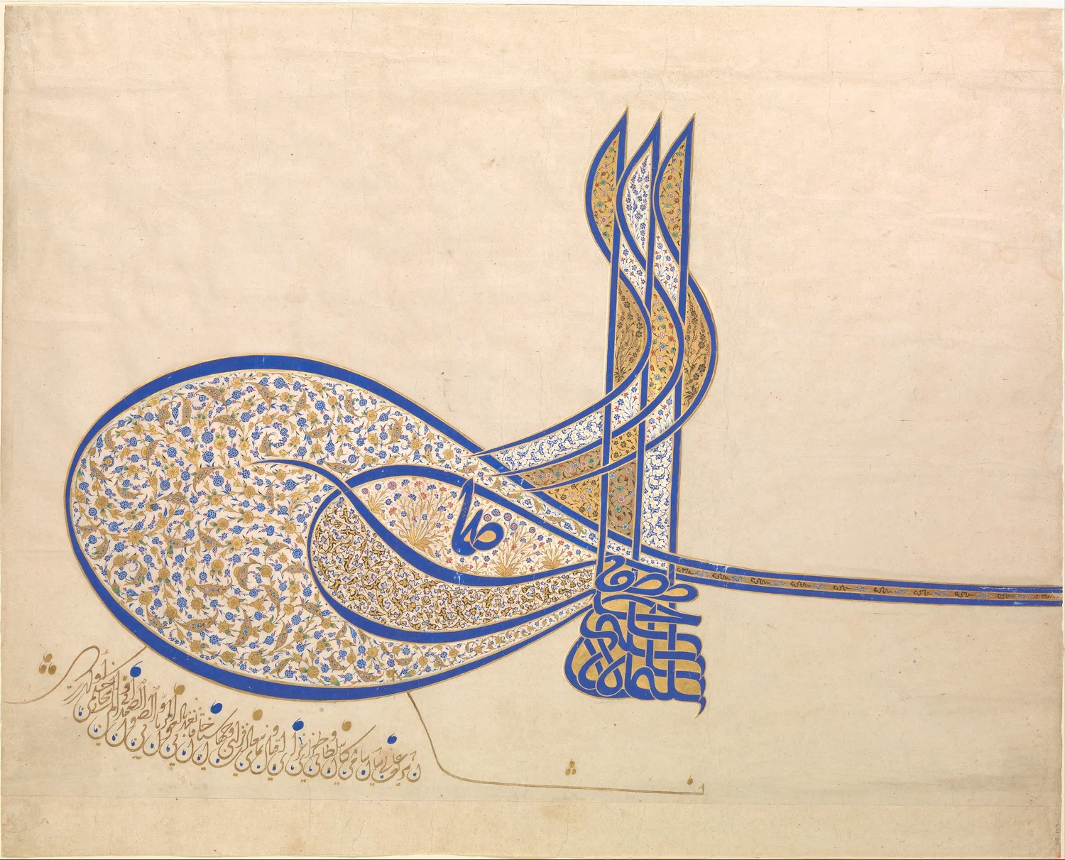
The longest lines in the image seem to be setting off across the page. The large ovals at the left gather ornament as if the paper had all the room in the world; the upright strokes rise close together. Then several lines leave toward the right. A reader can recognise a shape before finding a place to begin reading any words. That is useful for a device that once belonged to the top of an official document. Its shape could announce what sort of authority was at work before a reader reached the text below.
The Metropolitan Museum of Art identifies the object as a tughra of Sultan Süleiman, who reigned from 1520 to 1566. The museum dates the work to about 1555–60 and records ink, opaque watercolour and gold on paper. This is the visible part of a once larger document, kept today as a work in its own right. Its survival creates a tempting mistake. An elegant fragment looks self sufficient, and the viewer can forget that the form said something about what followed below, even when that following text is no longer in view.
A name that takes the shape of an emblem
The Met's teaching material describes a tughra as a calligraphic emblem used in the heading of Ottoman imperial documents. It could include a ruler's name and title, the father's name and a formula of victory. Those words were arranged within a distinctive design. They did not need to look like the opening phrase of a letter. The document could give readers both a written formula and a graphic form associated with authority, in the same painted place.
The translation signature helps explain how the function differs from an unrelated ornament. It can also mislead. A signature at the foot of a modern note is often imagined as an individual taking a pen to mark something just written. The Met's account describes a court officer responsible for adding the sultan's tughra to decrees. The fact that the mark names an authority does not imply that the named person painted every example. As a reader it is worth keeping three things separate: who was named, who had the role of placing the form and what work went into this particular execution.
For a viewer unfamiliar with Ottoman calligraphy, the shapes can be recognised as structures before they are read as script. The tall grouped strokes and the sweeping enclosed areas lead the eye along several different paths. There is no need to invent a translation by tracing them left to right. A museum explanation or specialist transcription gives context that the image alone cannot supply. Following the shapes prepares a different question: how do the written contents become recognisable as the figure they form together?
What the colours do to the line
In the Met's photographed example, the outline is strong enough to be seen from the small reproduction. The decorated areas become better defined as the photograph is enlarged. A viewer can look for the difference between a line which marks the structure of the tughra and the smaller patterns within it. The ornament works with the spaces the calligraphy leaves. If all the details had equal emphasis, the emblem would be harder to recognise from a distance. The extent of decorated surface does not prevent the broad movement of the strokes from remaining apparent.
Looking at the gold in a digital image gives a different experience from looking at a work on paper under changing light. A metallic surface can vary with direction and illumination. The image allows repeated examination, and the catalogue gives the material it records. It does not follow that the print or screen can show exactly how each area would brighten if a viewer moved a little. This matters to anyone trying to reconstruct a historical reading position. A desk, a fairly large sheet and the source of light would have been real objects around the emblem.
A simple exercise makes the difference between structure and detail visible. Reduce the reproduction to a size at which fluid outlines remain but small floral forms are hard to distinguish. Then restore the larger view. Notice what you could recognise while the details were gone. The large and small scales do not compete for a single task. One helps a reader grasp the whole form; the other helps a viewer see how much work went into the form that was grasped.
Begin with the blank around the fragment
A blank area in the photograph is not an invitation to assume there was always a corresponding blank on the complete document. The museum's teaching notes place the emblem at the head of a longer document known as a firman. On the page now shown by itself, the distance between painted design and surviving edge is part of the fragment's history. A viewer can see where the photo stops. The edge does not provide a line-by-line account of whatever once continued below.
It is useful to distinguish a question the fragment can answer from one it prompts. The colour, line and visible paper give evidence about the appearance and execution of the mark. The object record gives a name, date range and material. A question about the purpose of the full decree, its recipient or the words it used beyond the surviving surface requires other documents. A beautiful heading is not a complete summary of absent text. It may identify the kind of source a person should look for next.
A facsimile of a complete decree from a later time could show where heading, body and other elements occupied a longer sheet. It would not illustrate the absent text of this particular fragment unless the connection was documented. That distinction is as helpful to a museum reader as it is to a historian. Other objects can supply comparisons without supplying a missing half. The first act of comparison is to name what each example belongs to.
The shape belongs to writing, and to the work around writing
A printed name at the head of a modern page can be reproduced with one style throughout a set of forms. The Ottoman court had other means at its disposal. The official emblem had a recognisable composition, while the surviving works can show how the writing and decoration were executed on a specific sheet. Recognising a repeatable form is different from assuming that every part of a surviving example would be reproduced identically. It matters that the emblem belongs to a practice as well as to a single object.
A museum image of this scale can be cropped into a small icon. That makes the decorative signature handy for illustrating a subject, but a crop may omit the edges and traces below that help a reader remember it was attached to a page. Keeping an overall view in addition to a close view helps preserve both roles. Readers looking at the outer paper can understand an artifact. Readers examining a cluster of fine lines can ask how the design works as painting and writing.
One could take two notes from such a comparison. First, decide what detail is best seen at the scale of a single stroke. Second, decide what information would be lost if the margins went away. The notes will seldom be identical. That difference is a good guide to whether a reproduction suits a particular purpose. The accession number and collection link retain an important connection whenever the image has to be shown at only one scale.
The accession information is particularly useful here because the Met records another tughra associated with the same ruler under a separate object number, 38.149.2. The similarity of subject is no reason to substitute one reproduction for the other. The photographed fragment on this page is 38.149.1. Its catalogue dimensions, about 52 by 65 centimetres, also put the scale of the decorative work into perspective. An image downloaded to illustrate what a tughra is may be about the width of a hand on a screen; the preserved paper is substantially larger. A reader comparing two examples should be able to recover the dimensions and record of each rather than use the size of a thumbnail as a measure of either.
A heading can outlast the document around it
The strength of the form makes it easy to imagine the emblem as an independent composition. The object has become one for a modern viewer, in a real sense. It has a catalogue page, a measured surface and a photograph. Its other existence was as the top of a document. Reconstructing that role does not diminish the pleasure of looking at the ink and gold. It gives the large sweep of the script a place within the reader's former journey down the page.
Look again at the lines heading right. They lead across a surface that can still be measured, while the document once continued in another direction. One transition is visible; the other is recovered through the museum's account. A reader can keep both in view without trying to fill the absent page. The tughra survives richly enough to show what it meant to give an official text a recognisable beginning. It does not have to tell us how that text ended.