The White Branch on Atkins’s Blue Paper
Anna Atkins put a specimen directly on light-sensitive paper. The resulting plate records contact, the arrangement of branches and a decision about how an image could work in a book.
In this story 5 sections
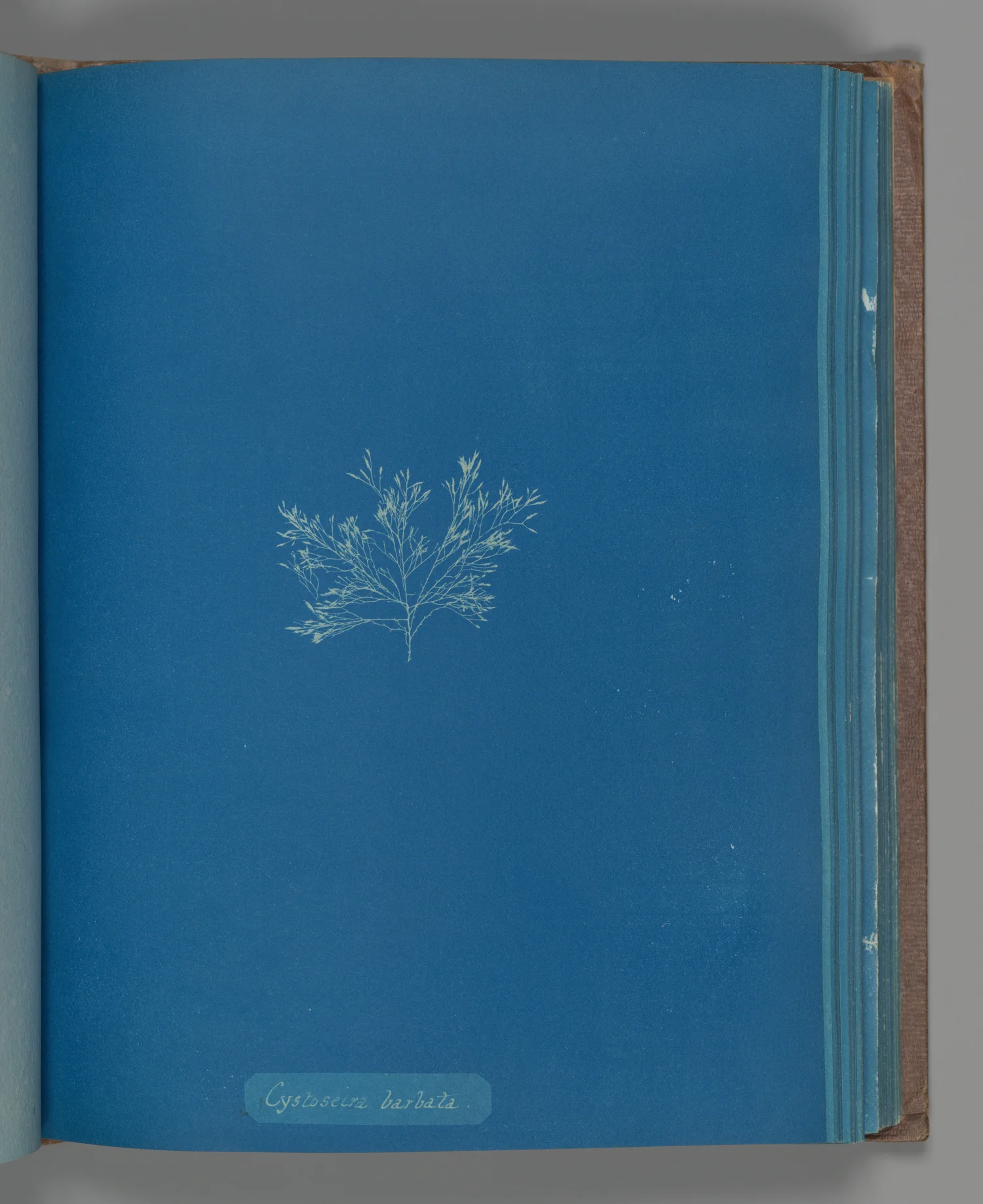
There is almost no room for the colour of the sea in Anna Atkins's picture of a seaweed. The blue running around the specimen belongs to the photographic process. Its paler shape is the place where light did not have the same effect on the paper. Instead of looking for the green or brown a collector may have seen, start with the narrow spaces left between the branches. The specimen has disappeared from this particular surface, but the intervals it held open are still recorded.
The Metropolitan Museum of Art credits Atkins with this cyanotype, Cystoseira barbata, dated about 1853. It measures just over twenty five by twenty centimetres. The plate belongs to the work known as Photographs of British Algae: Cyanotype Impressions, issued in parts beginning in 1843. Naming the whole project and naming one plate are different acts. The first identifies the book that used photographs to present specimens; the second gives a reader exactly one object to inspect and compare.
Light is used to keep the shape of a thing
The Met describes Atkins placing algae on prepared paper and exposing it to sunlight. The point of the arrangement is that an object can cast a local shadow while the exposed field changes. After processing, the regions that received enough light appear blue and places protected by the specimen can be lighter. For this type of contact picture there is no need for a camera lens between the algae and the sheet. The specimen sets the scale and carries the structure directly into the exposure.
That description sounds like a recipe for obtaining a silhouette mechanically. In fact, arranging an irregular specimen involves decisions before the exposure begins. A fine arm can overlap two others until they appear to be one. A collection of branches can be spread across much of the sheet or kept in a configuration close to how somebody lifted it. The choices left to the maker are easiest to recognise by looking at the places where branches separate into thin detail and the places where they merge. A photograph can be direct about how the light reached it and still be the product of careful placement.
Consider the difference between a branch that lies in close contact and one that rises a little away from the surface. The quality of the shadow can change. Thin or partly translucent matter need not block light in the same way as a thicker piece. A plate made by contact can reveal delicate detail while giving far less information about thickness, colour or the position the specimen held in water. Its precision belongs to particular properties. Appreciating it starts by recognising which ones have survived.
The space between branches also carries evidence
Read the plate from its denser area toward the fine ends. A branch looks separate because a strip of blue runs beside it. If two bright shapes touch, the edge between them may be invisible. The white of the object and the blue of the interval therefore do some of the same descriptive work. In a natural history book this is useful because a reader may want to compare the division of one shape with the division at another point. In a photographic collection it is equally useful because the spaces give the sheet a rhythm.
A line drawing would offer another kind of choice. An illustrator could separate parts that would otherwise overlap, draw a characteristic feature at a second size or show a view from another direction. The cyanotype has the persuasive quality of an object's having been present. That quality cannot replace every one of the illustrator's choices. A clear branch and an obscured one both belong to a direct record. The difference in clarity tells us where a second view or description could help.
It is likewise possible for a dark patch or a pale trace to belong to the preparation or later history of the print rather than the structure of the specimen. Look for whether a line follows the logic of branching and whether similar marks appear in the rest of the field. Better still, compare with another photographed plate or a description from the collection. Without that check, a reader can mistake a property of the image for a property of an organism about which it says very little.
An inscription brings a separate system to the picture
The Met explains that Atkins relied on William Harvey's published manual for names and labelled the plates. The reference gives a reason for the names to occur within a book of photographs. A viewer looking at one unfamiliar specimen might have a persuasive image and still not know how to locate it among other materials. A title, especially when tied to a published naming system, gives a search term and a point of comparison. Each of those functions remains useful in a digital collection.
Names can change as taxonomic practice changes. The title of an item in an historical photograph collection does not have to be the label a present-day scientist would use in every context. Keeping the recorded plate title is valuable for establishing which historical work is in question. It avoids inventing an update the photograph itself was not asked to supply. A person following a modern identification can look for separate specialist evidence without erasing the name under which the object was published and collected.
The accession details do another job. The project includes many plates, some of which can at first glance look like light branching forms on a dark ground. The number and item title allow one impression to be found again. Referring just to a blue picture by Anna Atkins can be sufficient in conversation; it becomes less useful when someone is trying to check an observation about one shape. A precise citation keeps the discussion connected to the particular plate.
Seeing the print and seeing the project
A large digital photograph lets the viewer follow branches more closely than a small printed reproduction. There may be advantages in seeing several plates at the same scale as well. If one image is zoomed tightly and the others are set well back, similar branching could look dramatically different because of enlargement. The museum's physical measurements help reduce that confusion. A row of pictures often equalises their digital display sizes even when their physical scales are not the same.
Reading across the project also does something that close inspection of one plate cannot. One arrangement can turn an object into a wide branching form. Another may show a narrow reach or give an object space near one edge of the sheet. As the layout changes, the field is still a consistent place for comparing forms. The label points outward to a name. The body of the image invites a return to placement and light. A book made from such pages can be used in both ways.
Atkins made the images while publishing materials in successive parts, as the Met records. A catalogue can gather a collection under one aggregate title, then open a single object without showing the layout of its original issue. That convenience is excellent for study at home. It should not suggest that the full project arrived as a simultaneous wall of independent blue squares. It had physical sheets and a history of circulation. Details about the order, mounting or acquisition of a particular set need the record for that set.
Look at the sheet before making it an illustration
The cyanotype process is familiar from blueprints, as the Met notes. Copying an architectural line drawing and arranging a natural specimen require different kinds of preparation even when light and prepared paper do related work. In the first case there is already a drawing to reproduce. In the second, one way to arrange the object has to be worked out on the sheet. The size and position of the form make a difference to what the exposure records. That difference gives the contact photograph part of its character.
A tempting reproduction might remove the margin and increase the saturation to make a more arresting block of blue. For decorative use somebody might want that effect. For examining the plate, the margin, subtler variation and position of writing can all matter. The colour shown by a screen is still a reproduced colour. It is a reasonable basis for noticing contrast and arrangement; it should not be substituted for a close look at the physical paper where precise appearance matters.
The plate reproduced here leaves substantial blue space around the specimen. The little form would sit differently on the page if it had been enlarged to fill it; it would also sit differently in a modern crop that hides the line of writing below. Keep the bottom edge in the frame and the inscription becomes part of the pace of reading, after the eye travels down from the branches.
Return to the narrow blue gaps that hold the pale branches apart. They show where parts of a specimen have not occupied the sheet, and how placement let a reader perceive the form. Seen next to the catalogue label, those gaps mark what the image and its maker make possible. The label names an object that can be found again. The paper lets its viewer study a shape left by contact, long after the specimen itself was lifted away.