What Makes the Bayeux Tapestry an Embroidery
The linen runs under the horses, lettering and borders. Looking for that underlying fabric explains why a work long known as a tapestry was made a different way.
In this story 4 sections
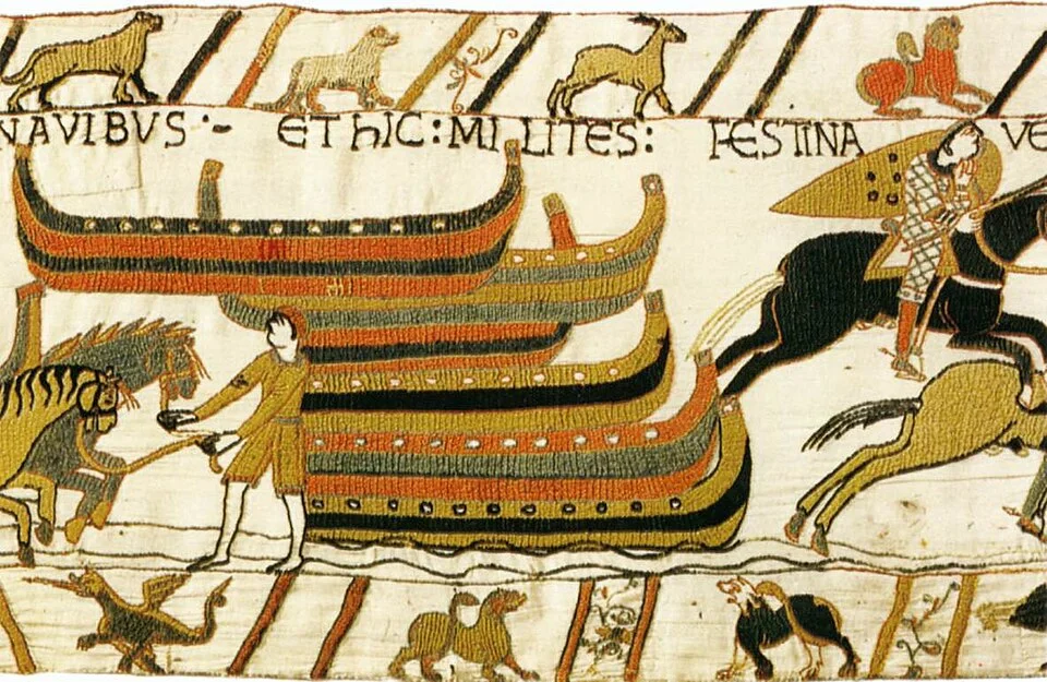
A horse from the Bayeux Tapestry can look more like a drawing than a piece of fabric. Its legs spread in separate directions, the bright cloth seems to appear behind it, and the edge of the horse is an event the eye can follow at a surprising distance. You might well describe the stroke of that edge before you consider what it has in common with the material behind it. Look across any expanse of apparently empty background toward the outline. The surface underneath the horse and the surface coming up to it belong to a continuous piece of woven linen. Most of what you have been reading as a picture entered that surface later.
Textile terminology makes this distinction particularly useful. In a woven tapestry the image is built as part of forming the cloth, typically with colored wefts where the image asks for different colors. In an embroidery, stitches put forms onto a fabric that already exists. The Bayeux Museum identifies the Bayeux work as an embroidered narrative in wool on linen, assembled from nine panels of cloth. Its familiar name is still a good way to find it in a catalog, and commonplace use need not change. Knowing what the makers were doing gives you a second, sharper set of questions to ask of the horses and words.
Find the piece that continues
Take a close image of one small scene. Put your attention first on a gap between two figures. The pale material already has a structure. Its threads cross in a largely regular arrangement. In an area of colored wool, the surface has new paths: a stitched line may curve and the direction of a mass of color can differ from the weave beneath it. At the boundary, both structures can in principle leave evidence. The base tells you what supports the edge. The stitches tell you how it was placed. In a reproduction that loses the fine detail of the linen, the two are likely to look more like different portions of a printed picture.
A very small demonstration can be made with a scrap of plain cotton and a piece of contrasting yarn placed across it. The weave in the cotton continues on either side of the bit of color. If you stitch the color in place, the base cloth can carry that path without letting it dictate the direction of the original threads. This is a limited analogy for the physical independence of the background and image. A valuable historic piece requires conservation and understanding beyond any scrap fabric. But the demonstration does let you see why the makers could do things along the face of the cloth that they did not have to do while weaving it.
What does the distinction do to a viewer’s account of a dark region? It explains why some places can visibly collect several paths of thread. Consider what happens when a solid color needs to occupy some area within a shape. A mass of individually small stitches and longer lengths of yarn laid across the shape offer different ways to do that. A border or a letter can ask for a controlled narrow line instead. One object can separate jobs materially before a room full of people ever separates them in a label. This is one reason the texture does not have to look identical in the whole length.
An outline and a fill have different work
The Bayeux Museum discusses several stitch types, including the laid and secured work often called couching or Bayeux stitch in descriptions of this piece. The longest threads visible across a filled place need not all pass individually through the fabric from one short step to the next. Threads can be placed across an area and held there by other stitched material. From a suitable close view, the directions of the surfaces and the means by which they are held may be observable at once. This makes the fill look quite distinct from the curves and inscriptions watched at a wider distance.
Think what would happen if the outline of a horse and the coat across its shoulder were made in exactly one uniform pattern of stitches. The smallest curves could be harder to pick out. A crowded color area could be laborious to lay down or have a texture you disliked. The maker has an expressive and practical reason to let the edge move differently from the broad surface, just as an illustrator today can fill one field with a wide tool and describe another with a narrow one. That analogy is more helpful if you then go back to the embroidery to find out which surface actually seems to change direction. It is not enough to assign all edges the same construction in advance.
A photograph of a pale landscape of linen and wool might invite a completely different assumption about color. Most of what a digital viewer sees is not raw evidence of a pigment or dye. The museum describes the plant sources associated with several families of dyed wool and discusses changes to its appearance. To connect a current appearance to the old material, use conservation findings and check how a photograph was produced. Describing a visible blue relative to a neighboring region is an appropriate observation. Naming what gave a particular yarn that color is an additional claim.
The scene takes a length of cloth
The work carries images and inscriptions across a very long band. It is possible to think of a figure as finished in one rectangular frame because that is what makes a good detail illustration. The edge of that rectangle belongs to the image provider. The figure itself joins other activity that may continue beyond the picture. Imagine showing the beginning and end of the same episode without displaying the middle. A reader might correctly recognize both actions and miss the meaningful delay between them. Resuming the full strip is often the quickest way to discover what has been lost in a selection of details.
The ground was made in joined panels. Do not assume the join always coincides with a natural paragraph in the story. A material boundary and a change in scene are two different tools, and either may occur without the other. If a museum account identifies a join, look for what the composition does on both sides. Does the main line of action continue? Does lettering reach near it? Keep track of what is identifiable as a join and what merely appears to be a vertical pause in a reproduction. This kind of comparison can be useful without assigning different parts of the work to proposed makers.
The horizontal spread puts a demand on any way of showing the whole thing. A view that fits a long sequence into one strip on a phone will sacrifice quite a lot of detail. A set of enlargements preserves the separate bits and asks a reader to reconstruct their order. A broad overview and a small repeatable reference such as a scene identifier let one travel between the two. For someone comparing a label, a photograph and a published detail, those navigational aids can be as informative as knowing the title of the work.
The small empty areas inside some letters may preserve the background much as a gap between two people does. Enlarging a word is one way to see the ground continue through the spaces that make separate parts legible.
Look at the work in several directions
A striking direction in the picture itself may conceal the directions of the threads. Imagine following the line of a moving horse from nose to leg. Whenever you reach another bright color, stop and see what part really changes. Does the placed yarn stop and a second field begin? Does a darker border make you think there is a larger break in the surface than there is? Label things you can judge from a reproduction, and leave structural claims that depend on another kind of view open. A photo can convey the expressive border very well and be too soft to inform you about individual stitches.
Readers can learn from a fairly simple sequence of views. Begin with the group of people or animals in a scene. Take a note of where the words appear in relation to them. Then choose a place where an outline meets a larger area of the same material and another place where it meets the bare background. Try to keep the approximate scale the same for both. This gives you a fairer chance of seeing what the underlying fabric contributes. A person who isolates a single dark spot can find darkness. A person who follows it to a boundary can see how it became part of the story.
Go back to the horse. Read the legs and head as acts of drawing but take particular care at the light background. Its continuity gives room for the line to run, the words to be placed and the viewer to move on to the next figure. The fabric does not have to disappear when these things become legible. One of the pleasures of the piece is that a story remains alive at the scale of the scene while the work of putting it there remains available at the scale of the thread.