What the Great Wave Prints Kept
Different surviving impressions of Hokusai’s wave keep different pieces of evidence about the work done between drawing, cutting and printing.
In this story 5 sections
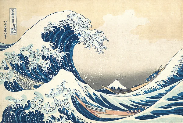
Try finding Mount Fuji before trying to make sense of the wave. It is the little triangle near the bottom, with its snowy shoulder tucked under an arc of water. There is a shape much like it immediately to the left, made from the shoulder of another wave. Hokusai gave a mountain that people might climb for hours the same dimensions as a momentary ridge of swell. The space between those two shapes seems small until you notice the boats and the people bent over in them. Now the mountain is very far away again.
That little change in apparent distance can happen in front of a book illustration, a print in a museum or a reproduction on a shop bag. On a museum’s collection page, though, there is another pair of distances to negotiate. One is between the design and the particular sheet that carries it. The other is between that sheet and the photograph that reaches your screen. When two reproductions look different, the difference can have entered at either of those steps. Looking for where it arose takes you through much of the craft of printing.
Start with two sheets
The Met calls its impression Under the Wave off Kanagawa. The object title continues with the Japanese title and the name of the series, Thirty-six Views of Mount Fuji. For this picture the object record calls the medium ink and color on paper. It also discusses the use of imported Prussian blue and indigo. A reader who only knows the croppings common on posters may be surprised that the image is a relatively small sheet. The sea looks big because the space on the paper was used so well.
Get another museum’s image of the same design and put the two in separate tabs. On a first pass, match the scale of the image by eye. If one tab shows a complete sheet with its margins and the other crops close to the design, the outside edges are poor guides. Use the endpoints of a long feature in the picture, such as the contour of a boat. The exercise is easier on a laptop than on a phone because you want both pictures in view at the same time. Full-screen mode, despite its name, can make the task harder.
Pick a patch with features small enough that you have to look closely. A patch of flecks on the lip of the wave is excellent for discovering how quickly the eye generalizes; it can take an effort to match one hook of foam to another. If you are trying to find repeatable differences, lettering or a relatively quiet line offers a more manageable starting point. Mark the position in your notes in terms of something both copies share. “Halfway between the end of the boat and the left edge of the mountain” will get you back to the same neighborhood. “Near the blue” may not.
A line is transferred, not redrawn
To make a woodblock print, a design is translated into surfaces that can carry ink to paper. Cutting away wood leaves raised parts that can print. A fine dark contour may therefore come from a surprisingly narrow ridge of material. Individual sheets can yield the same contour in much the same position because the ridge is used more than once. The dark line you see was pressed onto the paper; the printer did not have to draw it anew around every tiny patch of foam.
A colored print brings additional areas of ink into that relationship. The person printing has to put successive impressions in the intended place on the sheet. Think about drawing a figure on one transparency and filling a sleeve on a second. When they are in place the edges meet; move one very slightly and there is a seam, or a narrow streak of color crosses the edge of the sleeve. Registration is the problem of finding the intended position reliably on each pass. It explains why an interesting colored edge on the print may be a clue to how it was assembled, even when the individual cuts are invisible.
This division of work changes how you read a line. A slightly pale contour could come from the condition of the block, from how ink or pressure reached that part of one sheet, or from later changes to the paper and its surface. A short segment missing at exactly the same position in several impressions invites a different kind of inquiry. Did something change on the block that would account for a stable, recurring gap? You can ask the question of one sheet. You need several sheets to pursue it.
What repeated defects can say
Research by the British Museum compares surviving impressions on much finer terms than the casual distinctions between bright and dark pictures. From several sheets, a researcher can trace patterns of similarity and difference in small printed features. Evidence is stronger when several independent features tell a consistent story about the condition of a printing surface. That is a practical way to begin ordering some of the material before making claims about dates.
Even a plausible sequence does not turn into a calendar by itself. Suppose a contour appears complete in a set of copies and shows a matching gap in a second set. If the difference reflects a break that occurred while the block was in use, the group with the gap would generally come after the group printed with the intact line. The gap does not say what month the break took place. Nor would it make every sheet within the second group equally late. A second change, identifiable on the same part of another design element, could separate more groups. The imagined example is useful because it gives a divided answer: something about order, and very little about elapsed time.
Remember that one damaged sheet can be a poor witness. A scuff or an old crease may break a line where no difficulty ever arose at the press. Check whether the interruption follows the drawing or follows marks in the paper itself. It helps to put a small sketch of the interruption beside your written observation. The sketch will record what your eye originally saw before a story about its cause takes over.
Blue on paper and blue on a screen
The imported blue discussed by the Met can prompt a deceptively easy question: is this the blue you see on your display? For a visitor, “blue” is often one thing. For the study of ink and paper, a hue is an appearance and a pigment is a material. They are connected without being interchangeable. The color in a digital image can also vary with the lighting and capture of the object, the imaging and processing choices, and the way a display handles color. Two photos of the same sheet need not agree all the way across the sky.
Light and the condition of the paper matter even before photography comes into it. If a light ground has yellowed, a viewer compares the blue to a different surrounding tone than the one the original printer saw. Color contrast can change the impression of a passage without a viewer being able to say by how much. Long exposure to light can also affect some materials more than others. These possibilities are reasons to consult conservation research for an identification of pigment. They also make it useful to ask whether a difference is confined to one shape or runs through the sheet.
You can do an informal test of your own perception without assigning a chemical cause. On two museum photographs, compare a blue passage with its immediate paper surround. Then move to another blue passage near a different part of the surround. Make a three-part note: what appears different, where it happens, and what else differs nearby. The first two parts are observations; in the third you are already trying out ways to explain the observation. Treat that explanation as provisional. You might find the same comparison far more ambiguous on a different screen.
Keep the small context
One pleasant aspect of an object page is that it keeps information ordinary reproductions tend to drop. It gives the collection, an accession number, often measurements and sometimes a credit line or former owner. The accession number identifies the physical object for the institution. A filename or page heading can identify an image that happens to stand in for the design, and several online versions might have similarly generic headings. If you make notes comparing two sheets, copy both accession numbers before doing anything clever with the detail.
There is a difference between putting The Great Wave on a reading list and saying which impression you looked at. This becomes obvious when someone returns later to reproduce a comparison. They may see a color they would call brilliant in their current image and much less so in a second image. If your note specifies the sheet and the image provider, they at least know which comparison to attempt. The same care makes it possible for someone else to disagree about your observation instead of accidentally talking about another print.
There is some pleasure in reversing the exercise. After identifying your own quiet comparison, shrink both images until each is the width of your hand. You will almost certainly stop noticing the small discontinuity that occupied you a moment ago. What remains is the curve of a wave, the crouching figures and the little mountain that seemed barely worth naming at the beginning. The composition survived multiple pressings and the many ways people have chosen to display it. The narrow ridge of cut wood that put down one bit of contour could leave a record of use across multiple sheets. Both histories are available in the same picture, depending on where you put your eye.
Leave one tab open with the museum’s full view. The next time a familiar crop appears somewhere else, take a moment to see what made it into that crop: the boats, the lower border, the margin, the title cartouche. Notice whether losing part of the bottom narrows the room the boats have in which to move. This is an effect of the new presentation and needs no hypothesis about the paper or the blocks. Learning to separate a difference of framing from a difference of printing has an ordinary benefit: it lets the picture keep surprising you without requiring a discovery in every image.