Where Printing Stops in a Gutenberg Bible
Black type gives the pages a family resemblance. The colour, initials and bindings of surviving copies show how much of the book was still made by hand.
In this story 4 sections
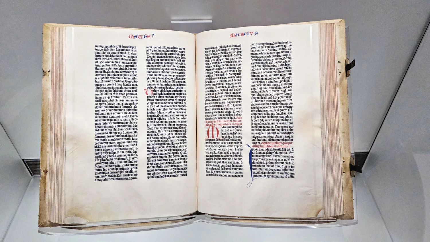
One of the first things that stands out in an open Gutenberg Bible is a colour that did not have to be there when the black text came off the press. Red and blue marks break up the two columns in the Library of Congress copy, giving a reader places to begin and find their way back. From a distance the colours look like another feature of the printing. Close up, they belong to a second stage of production. A page could leave the press with its regular text already in place and still need somebody to give its beginning a visible shape.
The Library of Congress keeps a copy printed on vellum, and its exhibition identifies the large coloured initials and headings as work done by hand. Its white pigskin bindings are later than the printing. Those details make the object in the display case more than evidence of an early European press. It is also evidence about the chain of work needed for a reader to receive several large, usable volumes. The decision to identify a work simply by the name of its printer makes sense in a catalogue. A careful look at the page restores some of the other work to the description.
A finished column can contain an unfinished opening
Choose a page from the Library of Congress display in which a coloured initial appears within the black type. Look at the black line beside it before looking at the detail of the coloured letter. The first full line can begin farther from the edge than the line beneath it. Where an opening was planned for work to be supplied later, the shape of the column is already responding to the expected piece of handwriting. A white interval on a page can therefore be a reservation of space rather than a failure to put text there. A person finishing the copy has to make something fit the available room.
Try covering the coloured part briefly. The letter disappears but the black material around it still makes a space. That little experiment is helpful when browsing a copy that was completed in a style you do not immediately recognize. The printed text may show where somebody expected an initial, while the local style determines how much of the available space a pen stroke fills. A hand can choose between restraint and extension within or near that outline. The black column establishes an edge without deciding all the effects of the colour beside it.
Colour also does a quiet job inside sections that already appear full. The Library of Congress notes red strokes that mark the beginnings of verses in its copy. Such a stroke can be much smaller than a chapter initial. Repeated across pages, small cues allow a reader to locate places where a larger ornament would distract or take too much room. Compare the signs that help you find a whole section with those that help you return to one line. Both belong to a working text. A photograph selected for ornament can favor the former while losing an account of the latter.
The black letters already remember handwriting
Use a magnified view of a few consecutive lines to inspect the black part on its own. The printed shapes resemble a dense Gothic book hand. A reader may quickly get used to the regular effect even without identifying every letter. That effect was made from individual pieces of type arranged to set the text. Some of the shapes represent combinations of letters or abbreviated forms with a history in scribal practice. They are evidence of how the printed book could be rooted in habits of reading familiar from handwriting. A page that now looks like proof of rupture between two technologies once offered readers many forms they already knew.
The adjacent lines need to form a block that remains legible from top to bottom. A typesetter works with a finite width, individual letter forms and the gaps needed between words. The mixture of forms can help fit text within the planned width, and also preserves ways of abbreviating that a practiced reader could recognize. It is misleading to imagine that all the choices were made by picking a single letter for every modern keyboard character. A familiar word in the printed Latin may take a form that one could not reproduce by typing its modern expansion and choosing a Gothic display font.
Farther from the page, the black shapes merge into two dark panels. The width of the gap between the columns starts to matter more than which abbreviation is in a given line. A letterform can be studied on its own and still be understood more fully once it is put back in its relationships. A large initial and the dense letterforms beside it work at two different scales. The initial gives someone a point of orientation. The black text makes it possible to turn that point of orientation into sustained reading. The usefulness of the opening depends on both.
Two copies can make different books out of the same edition
If you compare collections, begin by establishing that you are looking at roughly the same place in the text. The first exciting initial you find in one library’s presentation might belong to a quite different section from the one another institution chooses to show. Compare the printed text and its location before describing a difference in the colour. Once you have two comparable views, observe whether the initials are the same size, whether the colouring extends into the margins and whether the small marks within ordinary lines are handled similarly. A large change of effect can rest on a modest change in where the colour starts and stops.
The resource guide describes variation among surviving copies because finishing was not all done together in the press’s shop. Purchasers could make different arrangements for completing or decorating the work. A plainly finished copy can provide many useful places to navigate by while another brings more attention to its borders. Judging the success of those details requires asking what a person would do with them. The simple initials in one copy still have power when they point a reader to the correct line immediately. An elaborate copy can produce an additional effect in an opening without changing the words that follow.
There is a practical lesson in that comparison for anyone passing an image of the Bible around. Keep the collection and the copy attached to the photograph. A credit naming the library is a way to keep its particular book recoverable. It prevents a description of the binding or decoration in one image from being mistaken for a statement about all Gutenberg Bibles. When an archive has supplied a leaf number or a page location, keep that part too. A reader following your reference can reach the right view without relying on which image a search engine happens to display first.
The cover and the missing views
The cover image here shows the Library of Congress example open under exhibition conditions. That is a real view of a particular displayed opening. It leaves other leaves behind the one you can see. A digital interactive can allow a better view of lettering and thin strokes than a photograph taken through glass. It also changes the physical encounter. An individual page image does not convey how much material is gathered behind the opening or what the binding allows a reader to see close to the fold. In a physical display, glass, light and the angle of the open book are part of what a visitor actually experiences.
The material of the leaves matters in a description of the copy. Vellum is a fine parchment made from prepared animal skin. A photograph of the displayed opening can suggest a particular colour or texture, but it should not be used to identify the material for every extant example. The exhibition identifies it for this copy. The date given for the binding adds a later event to the history of the same object. A title that names the mid-fifteenth-century printing provides one date. The way the copy is gathered and protected can have a history that extends considerably beyond it.
Try writing a three-part label for this opening. Give the printed work its identification first, then describe one coloured detail you can locate, and finally name the physical copy and its present collection. That short label tells the next person where to look and which piece of the description might change when they move to another library’s example. It also gives an often anonymous stage of production a place beside the work that left a more familiar name in the catalogue.
Return to a single modest red mark, then move outward until the two columns come into view. Notice how quickly the little mark loses its identity and begins to contribute to a pattern for a whole page. That is good evidence of the scale at which the finisher was working. The decisions had to be useful in a line and work again when the reader stepped back to locate a passage. The press produced the recognizable bones of the page. The carefully placed work around them is part of why a reader could turn those bones into a book.